
Payroll design series: Part two of our makeover
Not long ago, we introduced some exciting changes to our payroll application, adding calendars and streamlining the process of running a payroll.
We talked to hundreds of small business owners to get feedback on what to improve. Something we heard over and over again was that small business owners need an easier way to see key payroll information, quickly and simply. For each part of this redesign our team worked hard to make the application simpler, easier, and faster, to make running payroll a better experience.
Take a look at our (ridiculously good looking) before and after shots!
It’s faster
Previously you had to use the Home page and the Payroll page to run a single payroll. Our team wanted to make it easier for you to run your payroll quickly— so now you can run everything right from your Home page.

Improved notices
We also wanted to make it easier for you to fix any issues we identify with your payroll— so we’ve redesigned how we show you notices. This is what notices looked like before the change:

Some of these were a bit hard to understand (seriously, what are “minimum precision requirements” anyway?). So along with the redesign, we added clearer descriptions to all of our notices.
This is what the new notices screen looks like:
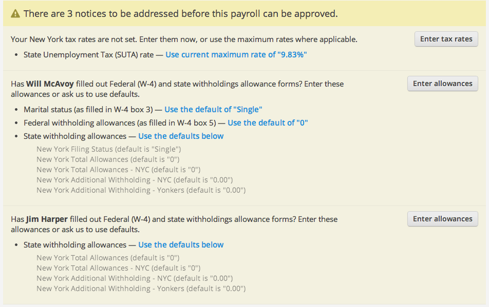
There are a few things I should point out here, the first is that the notices will appear in your Home screen. Notices will alert you to things that you should do to make sure your payroll accurate, and you will need to address them to run a payroll. We’re sticklers for good looking, accurate payroll.
We’ve added help text to the notices, so you know exactly where to find the information we’re asking for. We’ve also added in default rates you can choose to use if you are unsure of how to fill out the information.
In this redesign, we’ve worked hard to make notices and errors easier to understand, and easier to fix so you can get running payroll faster.
Approving a payroll
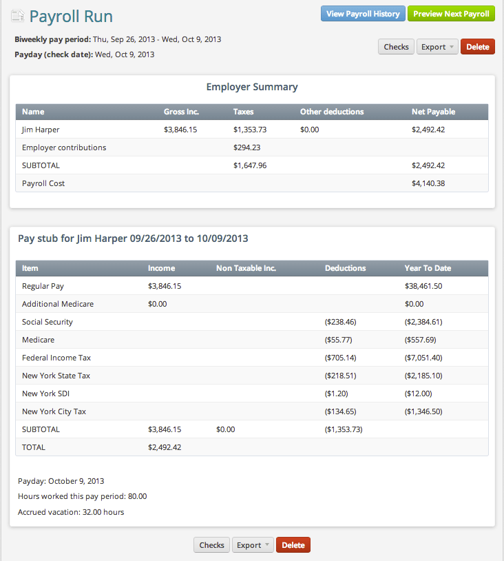
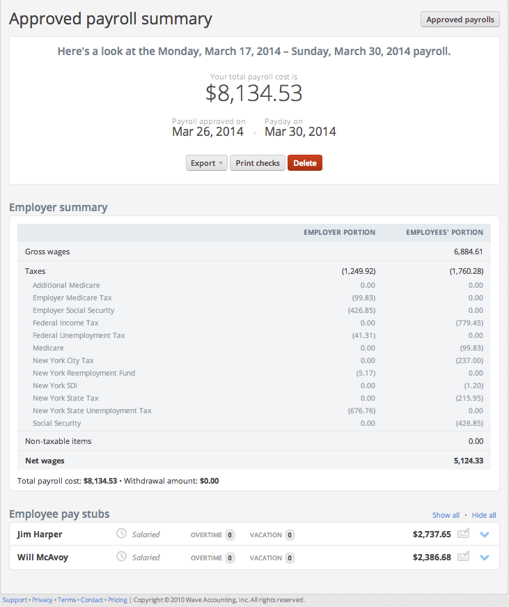
We’ve redesigned our Payroll summary screen to show you key information quickly. After you run a payroll you will see a snapshot of your payroll, including the total payroll cost, the day your employees with be paid (payday!), and other key information. You’ll also be able to export this information directly, review direct deposit transfers, print checks and preview your next payroll. Easy as pie.
Here is what this screen looked like before:

And this is what approving a payroll looks like now:
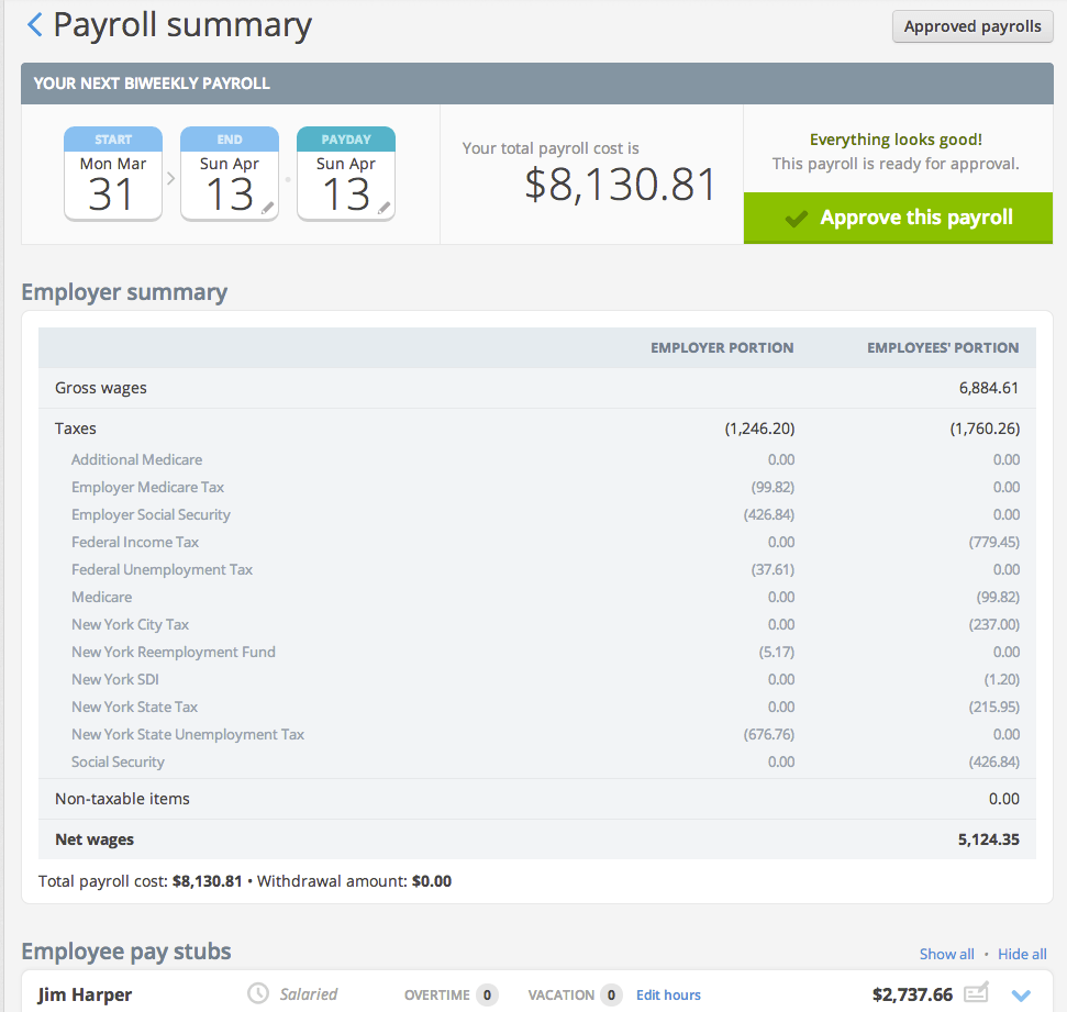
Information when you need it
Another goal we had when redesigning payroll was to make important payroll information easily accessible, so you can spend less time combing through the details.
To accomplish this, we moved the Employer summary and Pay stubs right on to the Home page. When you click Review this payroll these summaries will appear, and you’ll be able to expand your employees’ pay stubs to get a closer look.
We’ve worked hard to improve the look of our employee pay stubs as well, and I think you’ll notice a big difference. Below is what the pay stubs looked like before the change:
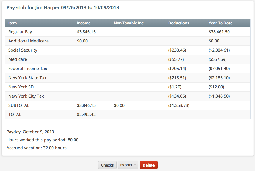
And this is what the new pay stubs look like:
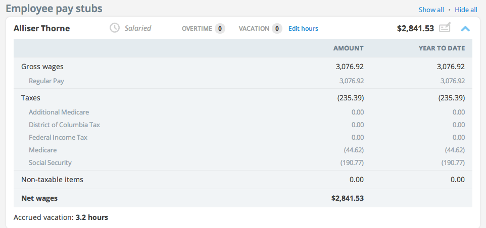
(Right?)
To speed up your payroll process we’ve added some key markers that will give you at-a-glance information about your pay stubs. Beside the amount on the pay stub, there is an icon indicating if that employee is being paid by check, or through direct deposit.
You can also quickly see if an employee is hourly or salaried, if overtime was applied to this pay period, and how many vacation hours were used. You’ll also notice that we no longer show you blank columns, which make the pay stubs easier to read.
Previously approved payrolls
Before the change, you would go to the Payrolls tab to look at past payrolls, or previously approved payrolls, and to preview your next payroll.
This is what the old Payroll History screen looked like:
We have now consolidated this information, and made it easier to access right through the Home screen. Simply click on Approved payrolls to review past payrolls, and payrolls you have approved for the future. This is what the new Approved payrolls screen looks like:
Sign in now to check to see how good your new payroll looks!
We hope that these changes help make your payroll experience faster, and better. If you have any feedback on these improvements, please visit our Community.
Not using Wave yet?
Wave’s free financial management software makes it easier to invoice clients, get paid, and manage your books. Simply visit waveapps.com, click on “Create your free account,” and enter your email. You’ll be up and running in seconds. Try one of our free webinars to get the lay of the land, and download a copy of Fearless Accounting with Wave to get started with confidence.
(and create unique links with checkouts)
*While subscribed to Wave’s Pro Plan, get 2.9% + $0 (Visa, Mastercard, Discover) and 3.4% + $0 (Amex) per transaction for the first 10 transactions of each month of your subscription, then 2.9% + $0.60 (Visa, Mastercard, Discover) and 3.4% + $0.60 (Amex) per transaction. Discover processing is only available to US customers. See full terms and conditions for the US and Canada. See Wave’s Terms of Service for more information.
The information and tips shared on this blog are meant to be used as learning and personal development tools as you launch, run and grow your business. While a good place to start, these articles should not take the place of personalized advice from professionals. As our lawyers would say: “All content on Wave’s blog is intended for informational purposes only. It should not be considered legal or financial advice.” Additionally, Wave is the legal copyright holder of all materials on the blog, and others cannot re-use or publish it without our written consent.


